
Showing posts with label Jillian Player. Show all posts
Showing posts with label Jillian Player. Show all posts
Sunday, April 3, 2016


Friday, October 31, 2014
Nicholas Vandergugten by Jillian Player
Nicholas Vandergugten
An Exhibition of New Print and Multimedia Work
The Earth shifts elusively, jumping and distorting, looking like the moon shining luminously behind a silhouetted forest. But it's the planet Earth. We are not supposed to see our blue-green globe from this vantage. And that's just the point. Nicholas Vandergugten wants you to view our home planet from a disparate perspective. He has provided the platform for the viewer to reflect on the idea of “what if…?” This question seems to thread through Vandergugten's work.
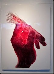
Nicholas Vandergugten’s collection of prints and video at the Fifty Fifty shows a formalization of intent in his art process. Nicholas works with the large epical themes of love, personal meaning, and our relationship with nature and each other. From the earlier print works such as the Miner/Muse series and text based work, some of which have been included in this exhibit, Nicholas is continuously stripping down the arduous print process and the intention of his work. This is apparent in his new print work of large-scale hands in which he examines the art of the gesture of the human figure, distilled to just the hand. The hands are bold yet comforting in a way that only print can be. One can see the relief of the deliberate cut into the large lino, which Nicholas buys from flooring companies. The images have been painstakingly worked and hand rubbed like a conscientious lover. Using his invention of vellum paper, disc baren, and epoxy, Nicholas wanted to create large-scale prints like none before him. You can see the progression of perfecting the process in the 3 x 4 foot works if you look carefully from one to the next. Most of the hand images portray the fingers laced together, cradled, ready to hold something, and one print is of a hand holding a seed head of grass, ready to throw. The scale of the voluminous, red-toned hands allow the viewer to be enveloped by the gesture. Some have said that they feel cradled by the hands or see them in a more sexual context, and some see a spiritual light radiating from the palms. This is what Vandegugten wants to hear. At the crux of his work is his desire to create a platform, not an opinion–a nudge for further introspection or dialogue.

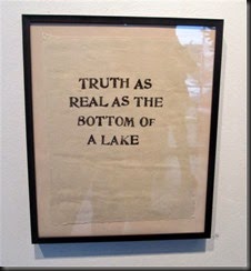
Vandergugten's text based one off prints are a good example of this platform. In the laborious task of printmaking, Nicholas began writing down ideas on sticky-notes to ponder later. He stuck the notes on the wall, side by side. One day he would get to them. Meanwhile, while looking at them abstractly, he realized that they were works unto themselves. This gave him a great feeling of freedom. Like his influence, John Baldessari, he found potential in the narrative and associative power of text within the boundaries of art. He created one off prints of the sentences without personal judgment, knowing that he came to them with honesty. The bold text and 8” x 10” black frames have given these whims and hunches license to exist.
Vandergugten's examination of the overview effect led him to create the video loop called Diving Bowl, which is part of the Antimatter Film Festival on now in Victoria. The overview effect is a cognitive shift in awareness reported by some astronauts and cosmonauts during spaceflight, often while viewing the Earth from orbit or from the lunar surface. From space, astronauts claim that national boundaries vanish and that the conflicts that divide humanity become trivial. They talk of a need to create a global society, united by the obvious imperative to protect our "pale, blue dot.”
To create the Divining Bowl video, Nicholas projected an image of the planet Earth through the side window of a car onto a backdrop of the forest at night. A video camera was in the passenger seat pointing out at the projection as he drove through the forest-lined roads. The result is a disjointed, jittery and distorted image that is both compelling and discomforting. In the gallery the image is played on a loop and projected onto a piece of mylar attached to the window, so it can be seen from both inside or outside.

Nicholas Vandergugten's work at the Fifty Fifty gently nudges us towards the lofty ambition of an overview effect. His honesty and sincerity to tackle grandiose ideas comes through, and one wants to encourage his zeal. Nicholas' repulsion of pretension keeps the work reserved and sufficiently spare. One must take their time and allow the words, images, and video take you to a state of cognizance. “Truth as real as the bottom of a lake”–come on, you know what he means.
Nicholas Vandergugten will be showing at the Fifty Fifty Arts Collective, 2516 Douglas St, Victoria BC, until November 9th.
Jillian Player is an artist and occasional writer in Victoria BC
jillianplayer.com
An Exhibition of New Print and Multimedia Work

The Earth shifts elusively, jumping and distorting, looking like the moon shining luminously behind a silhouetted forest. But it's the planet Earth. We are not supposed to see our blue-green globe from this vantage. And that's just the point. Nicholas Vandergugten wants you to view our home planet from a disparate perspective. He has provided the platform for the viewer to reflect on the idea of “what if…?” This question seems to thread through Vandergugten's work.
Nicholas Vandergugten’s collection of prints and video at the Fifty Fifty shows a formalization of intent in his art process. Nicholas works with the large epical themes of love, personal meaning, and our relationship with nature and each other. From the earlier print works such as the Miner/Muse series and text based work, some of which have been included in this exhibit, Nicholas is continuously stripping down the arduous print process and the intention of his work. This is apparent in his new print work of large-scale hands in which he examines the art of the gesture of the human figure, distilled to just the hand. The hands are bold yet comforting in a way that only print can be. One can see the relief of the deliberate cut into the large lino, which Nicholas buys from flooring companies. The images have been painstakingly worked and hand rubbed like a conscientious lover. Using his invention of vellum paper, disc baren, and epoxy, Nicholas wanted to create large-scale prints like none before him. You can see the progression of perfecting the process in the 3 x 4 foot works if you look carefully from one to the next. Most of the hand images portray the fingers laced together, cradled, ready to hold something, and one print is of a hand holding a seed head of grass, ready to throw. The scale of the voluminous, red-toned hands allow the viewer to be enveloped by the gesture. Some have said that they feel cradled by the hands or see them in a more sexual context, and some see a spiritual light radiating from the palms. This is what Vandegugten wants to hear. At the crux of his work is his desire to create a platform, not an opinion–a nudge for further introspection or dialogue.

Vandergugten's text based one off prints are a good example of this platform. In the laborious task of printmaking, Nicholas began writing down ideas on sticky-notes to ponder later. He stuck the notes on the wall, side by side. One day he would get to them. Meanwhile, while looking at them abstractly, he realized that they were works unto themselves. This gave him a great feeling of freedom. Like his influence, John Baldessari, he found potential in the narrative and associative power of text within the boundaries of art. He created one off prints of the sentences without personal judgment, knowing that he came to them with honesty. The bold text and 8” x 10” black frames have given these whims and hunches license to exist.

Vandergugten's examination of the overview effect led him to create the video loop called Diving Bowl, which is part of the Antimatter Film Festival on now in Victoria. The overview effect is a cognitive shift in awareness reported by some astronauts and cosmonauts during spaceflight, often while viewing the Earth from orbit or from the lunar surface. From space, astronauts claim that national boundaries vanish and that the conflicts that divide humanity become trivial. They talk of a need to create a global society, united by the obvious imperative to protect our "pale, blue dot.”
To create the Divining Bowl video, Nicholas projected an image of the planet Earth through the side window of a car onto a backdrop of the forest at night. A video camera was in the passenger seat pointing out at the projection as he drove through the forest-lined roads. The result is a disjointed, jittery and distorted image that is both compelling and discomforting. In the gallery the image is played on a loop and projected onto a piece of mylar attached to the window, so it can be seen from both inside or outside.

Nicholas Vandergugten's work at the Fifty Fifty gently nudges us towards the lofty ambition of an overview effect. His honesty and sincerity to tackle grandiose ideas comes through, and one wants to encourage his zeal. Nicholas' repulsion of pretension keeps the work reserved and sufficiently spare. One must take their time and allow the words, images, and video take you to a state of cognizance. “Truth as real as the bottom of a lake”–come on, you know what he means.
Nicholas Vandergugten will be showing at the Fifty Fifty Arts Collective, 2516 Douglas St, Victoria BC, until November 9th.
Jillian Player is an artist and occasional writer in Victoria BC
jillianplayer.com
Sunday, August 17, 2014
Co-Mix Cover Art Show – opening night – Martin Batchelor gallery
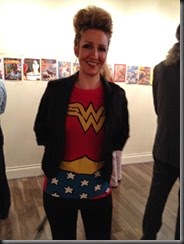
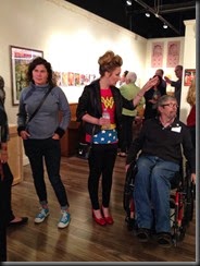
some stills from the opening night !
Remember the show is free and it will run until August 30th.






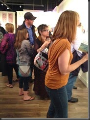
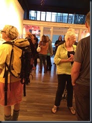
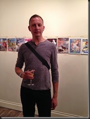
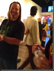


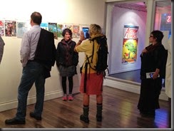


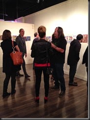

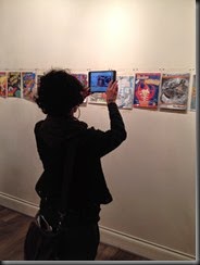
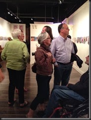


Remember the show is free and it will run until August 30th.


Monday, November 25, 2013

Wednesday, November 6, 2013

Saturday, September 7, 2013

Friday, July 12, 2013
“ Change ” installation by Chris Lindsay reviewed by Jillian Player
Spare, elegant, and intriguing are some of the first impressions that come to mind as one enters Deluge’s bright, clean environment. Chris Lindsay’s site-specific installation hangs over your head, precariously monopolizing most of the room. Evenly spaced and obsessively executed strands of airplane wire attach to three horizontal wooden beams at one end of the ceiling, and curve gently towards the floor, hanging menacingly just above, before they swoop towards their perch at the other end of the ceiling, where the wires attach to a large, wooden-crossed beam that resembles a telephone pole. The vertical beam is purposely left rough and untouched, since its shedding of bark. It rests on a slight angle with its bottom end tilting off the ground and a tiny piece of wood jammed into the space. Heavy cables hold the upper end of the beam in place, or the whole body would tumble into a sad heap. The sense of gravity in the room is palpable. One can almost smell it. Am I getting a lesson in physics here? As one moves from piece to piece, one never leaves the pressure of the overhead structure.This precarious feeling flows through all of Lindsay’s enigmatic objects in the exhibit.
There is a criss-cross, or spirograph-like pattern that continuously changes as one moves through the room, looking up through the three layers of wire. The same patterns play out in a smaller scale through a row of coloured squares on the floor. From a distance they look like flat plates of coloured glass. But, when observed closely, you see the threaded patterns emerge. Optical illusions of colour, string, and metal: one is mesmerized as one walks around, over and between them. Like a contemporary dance to silent music, observers bend from the waist, bobbing their heads back and forth, and up and down to achieve the full potential of the plates.
Movement continues to a kinetic sculpture of nails, wood, and metal. All resist static quality as the structure gently rocks, swings, and shimmers. All seem perpetually conflicted, yet there is a delicate balance of art and science.
Science finds its way into the exhibit by way of an old slide projector showing two slides, both from the University of Victoria’s Scanning Transmission Electron Microscope (STEHM), the world’s highest-resolution microscope. The projection sits quietly unobtrusive and adjacent to one corner of the room.
There is one piece of sculpture from Chris’s grad show: the keys of two pianos, manipulated to create a grid. It is the most painterly piece in the exhibit as it could easily hang as a piece of art on a wall. There is a beauty here that suggests entropy. The romantic old stories of fingers caressing the keys of these vintage pianos seem a little out of place with the overall exhibit, yet the missing piano strings are a reminder of the pattern of vibration.
Discrete elements meeting in mutually supportive combinations seem to be the inspiration that drives Lindsay to create ambiguous sculpture. He talks about the fragility of the planet and how we have gone too far with our obsession with destroying our resources. Yet, I find relief in humanity as I watch people getting amusement from these simple methods of illusion in his creations.
Curiosity is what kept Lindsay going as a microbiologist, and it is this same curiosity that propelled him through art school, having completed his MFA two months ago. His work is already in demand—he was asked to exhibit at The Nanaimo Art Gallery in August of this year. It seems Chris Lindsay’s never ending curiosity will be his driving force, and we are so lucky he has chosen art to share his observations.


Change
Chris Lindsay http://christopherlindsay.ca/
June 28 - July 27
Deluge Contemporary Art
636 Yates St, Victoria
Jillian Player is a visual artist that likes to write art reviews . - http://www.jillianplayer.com/
There is a criss-cross, or spirograph-like pattern that continuously changes as one moves through the room, looking up through the three layers of wire. The same patterns play out in a smaller scale through a row of coloured squares on the floor. From a distance they look like flat plates of coloured glass. But, when observed closely, you see the threaded patterns emerge. Optical illusions of colour, string, and metal: one is mesmerized as one walks around, over and between them. Like a contemporary dance to silent music, observers bend from the waist, bobbing their heads back and forth, and up and down to achieve the full potential of the plates.
Movement continues to a kinetic sculpture of nails, wood, and metal. All resist static quality as the structure gently rocks, swings, and shimmers. All seem perpetually conflicted, yet there is a delicate balance of art and science.
Science finds its way into the exhibit by way of an old slide projector showing two slides, both from the University of Victoria’s Scanning Transmission Electron Microscope (STEHM), the world’s highest-resolution microscope. The projection sits quietly unobtrusive and adjacent to one corner of the room.
There is one piece of sculpture from Chris’s grad show: the keys of two pianos, manipulated to create a grid. It is the most painterly piece in the exhibit as it could easily hang as a piece of art on a wall. There is a beauty here that suggests entropy. The romantic old stories of fingers caressing the keys of these vintage pianos seem a little out of place with the overall exhibit, yet the missing piano strings are a reminder of the pattern of vibration.
Discrete elements meeting in mutually supportive combinations seem to be the inspiration that drives Lindsay to create ambiguous sculpture. He talks about the fragility of the planet and how we have gone too far with our obsession with destroying our resources. Yet, I find relief in humanity as I watch people getting amusement from these simple methods of illusion in his creations.
Curiosity is what kept Lindsay going as a microbiologist, and it is this same curiosity that propelled him through art school, having completed his MFA two months ago. His work is already in demand—he was asked to exhibit at The Nanaimo Art Gallery in August of this year. It seems Chris Lindsay’s never ending curiosity will be his driving force, and we are so lucky he has chosen art to share his observations.


Change
Chris Lindsay http://christopherlindsay.ca/
June 28 - July 27
Deluge Contemporary Art
636 Yates St, Victoria
Jillian Player is a visual artist that likes to write art reviews . - http://www.jillianplayer.com/
Friday, June 7, 2013
Trish Shwart Cycle of Renewal Installation, Metchosin Art Gallery Review by Jillian Player


Trish Shwart uses universal images like the elements, home, child, and dog to translate her ideas of overcoming adversity, through a small, dioramic-tableau installation in the hall just outside the main gallery at the Metchosin Art Gallery. The installation is understated in its minimal palette and material, yet speaks volumes with its use of symbols. The work consists of a tableau inside three horizontal boxes attached together that hang at eye-level on the wall. Everything is painted a stark, gallery white. Inside each white box is a diorama made of collages of photos, mylar, foam-core, wood, and drawings. Reading the boxes from left to right, Shwart starts her narration of transformation with a simple domestic scene of a quiet home with trees and houses all around. The second box consists of stark trees all around, and at the centre is a bonfire. To the right of the fire a dog is walking away from the flames. In the third box, the rain is falling but the sky is clear to one side. A girl (or student) is looking up at birds flying. The metaphors are simple and clear, yet can be deciphered individually. The work here is clean, quiet and compact. Shwart said she struggled not to over- fill the boxes. Keeping the central, three-dimensional objects key to the story was all she really needed after deleting the excess. Trish was tackling some big questions while working on this little installation. Her artist statement talks about connection of body, mind, and spirit. And, she is asking questions like “Are we our bodies?” or “Do we inhabit our bodies?” These are big questions that might not necessarily be answered by this installation, nor might the viewer arrive at this inquiry with the work. That aside, inside the boxes, the story is a familiar one, of overcoming adversity, but Shwart’s telling of this theme is made fresh and unique by the use of her materials, palette and contemporary approach. It hangs quietly fragile, and draws one into its stark beauty.
Jillian Player
Cycle of Renewal will be on exhibit at MAG – June 6-July7, 2013
Opening reception – Saturday, June 8th, 2-5pm
TrishShwart.weebly.com
Friday, March 29, 2013
Precarious Circumstance reviewed by Jillian Player


Shutting the loud, bustling street outside, I close the door to the gallery and feel like I've entered a womb-like environment shaded in the quiet, muted tones of grey. Or, maybe because there is no colour, it's more brain-like. I walk through thoughts of life, death, and children, all flowing through the synapses of paper winding through this capsule. Inside the gallery it is like a shrine to paper. Large scale charcoal and conte drawings on paper and loosely cut paper mobiles fill the space.
Joanne Hewko's large charcoal drawings in the entrance hold you there as your body starts to sway like a pendulum with the weight of the drawings subjects. They say, “I'm in mourning.” Here lies anger and sadness, yet there are glimmers of hope, and an effervescent bubbling-up of emergence and optimism. Each drawing, an average of 30x48 inches, have a portrait-like subject in the centre, some are split horizontally like landscapes, but all have the duality of heaviness and it's opposition: lightness. The objects in the drawings seem to be in motion, either swaying or floating. They hover, waiting for someone to make a decision where they should go. One can see the artist's hand in this work. Hewko has infused her emotions by rubbing, stroking, and grinding the pigment into the paper like some pagan spell-maker casting out her subconscious desire.
Entering the main cavity of the gallery is Cowen's work. (I say that literally) It gently breezes past you like you're swimming through a white paper kelp forest. These hand-cut paper mobiles drift through the space like hanging tendrils of thoughts. Just like Hewko, one can see the artist’s hand here. Cowen has spent many hours meticulously hand-cutting these tendrils of loops upon loops. They remind me of childhood paper cuttings of snowflake patterns, or paper people that are all joined together, one after the other. I try to look at each one individually to acknowledge their uniqueness. I also observe them as a group, to focus upon Cowen's design attempts, and to respond to the idea of “multitude” and its effects on me. I ask Sarah why she has strictly kept to the theme of loops. She answers that she wants the discipline of sticking to one thing. This repetitive, work-by-hand discipline is what keeps her present, it reminds her that she is alive. Both artists' work would fit naturally in the genre of the “Art of Labour.” That is really what this work is about: two women toiling to relieve the pressures of life. That is probably why the work seems embryonic and cerebral at the same time. Joanne said she tends to live in the future and Sarah said she lives in the past. In this body of work they have met in the middle, the present.
Sarah is still building her installation, strand by strand, but hopes to be finished by the closing reception of April 6th.
Precarious Circumstance - Artists Sarah Cowan and Joanne Hewko can be seen at Gallery 1580. - 1580 Cook St. Victoria, BC. Tuesday through Saturday, noon to 5pm. http://gallery1580.com/
Friday, March 22, 2013
Intemperate by PJ Kelly reviewed by Jillian Player

I Have Trouble With Rectangles
By Jillian Player
Pj Kelly's gone totally abstract. I try agonizingly to pull sophisticated rhetoric out of her
as she explains her process for her bright, colour-infused works. But all she has to say is,
“It makes me happy.” Then a couple walks into the Polychrome Gallery on Fort Street
where we are sitting on the white leather sofa, and they immediately remark, “These are
happy!” Well, I'm done in. Okay, PJ's work is... happy!
As we move deeper into conversation she does have a lot more to say about her work.
Her latest body of work, showing currently until March 28th at Polychrome, is a collection
of wooden panels of various sizes. The white walls of the gallery burst with colour. Clear,
untainted acrylic colour, covered with very precise dots and three dimensional acrylic
build-ups. Drop after drop, there emerges patterns, conflicts, and an orderly chaos.
Within the body of work titled Intemperate, there are three separate bodies of work.
The Tonic series consists of small- to large-scale square wooden panels painted in
squeegeed acid washes of acrylic with orderly constructed drops of paint. Either in
complimentary or contrasting colour, the panels were a simplifying process for Kelly, as
she wound down from her previous work. Yet the works are highly complex in their
simplicity, I would say the most complex yet of her work to date. Because there is
nothing else to look at except the dots of various sizes running in a uniform pattern
across squeegeed acrylic hues of orange, blues and greens. These dots have to work or
else there is disaster. These panels are meant to keep you awake and draw you in; one
does not stray from them. The panels are on their own or grouped together to create
large-scale works. A purchaser can have an interactive experience with the work as they
have free will in which way they would like to hang the art. Kelly is investigating colour in
it's purest form. She is not tinting or using any white. It's straight from the tube, or I
should say, bottle.
Then there is the Frontier series. These smaller square panels and, dare I say, even some
rectangles, range in size. Some of these works are reminiscent of Tonic, but with a third
dimension to them, and some works are a tumultuous, deep layering of dots upon dots:
so many dots that one can get lost. PJ got lost a few times, too. Then she found that she
could add discarded, dried acrylic paint to the canvases. Then she started to build small
forms. Then she started to dry acrylic paint on glass and sandwich them all together and
cut the layered pieces it into slices. And then she found order in the chaos. The eyes can
rest on these three dimensional nubs that sit precariously on the canvas and give the
paintings a sense of purpose. PJ said that while doing this series she had so much work
that she had nothing to lose, so she started to build. Building things with her hands came
naturally to her. The small sculptures reminded her of making hippie, Fimo jewellery and
tile mosaics.
The third series contains two paintings called Colour Cycles. These two 24x24 inch pieces
challenge the viewer with conflicts of composition and method. Their backgrounds are of
squeegeed black on white with thick swaths of primary colour stroked across the panel,
and a series of dots patterned in simple geometric design. The panels relate in opposition
to each other. These works reflect earlier work and show Kelley’s love for graphic
black-and-white. They also hint at Kelly's early influences of Bill Porteous and Cindy
Shin-Min Wang.
Kelly's work evokes the iconic freshness of Pop Art and Lichtenstein's “dot.”
Reminiscences of watermelons, key lime pie, and candy are brought to mind with the
Tonic series. Kelly said, “The 'dot' became the vehicle for driving around my canvas.”
Experimenting with unadulterated colour became her optimistic investment in painting,
as she wound her way through the anarchy of her studio and came out the other side
with fresh, intelligent, luscious work.
Intemperate
Abstract paintings by PJ Kelly
Polychrome Fine Art
977-A Fort St. Victoria BC
March 14 – 28,2013
Wednesday, March 20, 2013

Subscribe to:
Posts (Atom)